Introduction
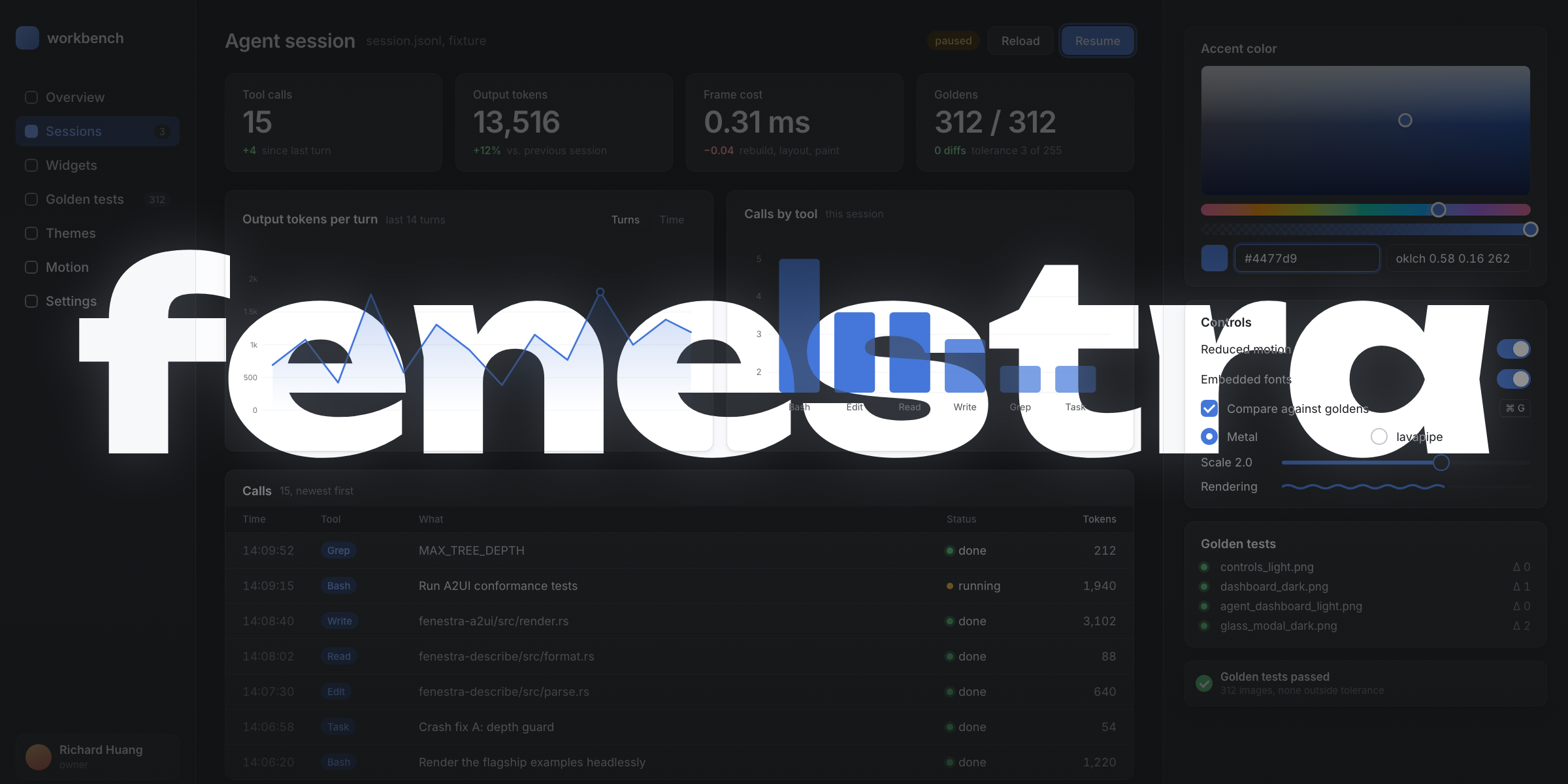
fenestra is a pure-Rust native GUI framework: winit windowing, wgpu GPU access, vello vector rendering, parley text shaping, taffy flexbox/grid layout. No browser, no webview, no HTML/CSS parser — and two commitments that shape everything else:
- Web-grade aesthetics by default. OKLCH color ramps generated from accent hues, 4px-grid spacing, layered soft shadows, real typographic hierarchy, focus rings, 120-300ms easing. The widget kit looks like a polished web product out of the box, and an editorial design language (custom faces, free-form type, duotone fields) is a few calls away.
- You can see what you build — programmatically. Rendering is a pure
function of
(element tree, theme, size, scale), it runs without a display server, and it is deterministic. Humans get golden tests; AI agents get a build → render → look → verify loop (AGENTS.md is the agent manual).
Try the live demo — the same code compiled to WebAssembly, rendering through WebGPU.
Where things live
| Crate | Contents |
|---|---|
fenestra | facade: run(), prelude, examples |
fenestra-core | element IR, theme, layout, text, paint, input, accessibility |
fenestra-shell | windowed runner + headless renderer and test harness |
fenestra-kit | the themed widget kit |
Getting started
cargo add fenestra
use fenestra::prelude::*;

struct Counter { n: i64 }

#[derive(Clone)]
enum Msg { Inc, Dec }

impl App for Counter {
    type Msg = Msg;

    fn update(&mut self, msg: Msg) {
        match msg { Msg::Inc => self.n += 1, Msg::Dec => self.n -= 1 }
    }

    fn view(&self) -> Element<Msg> {
        col().p(SP6).gap(SP4).items_center().children([
            text(self.n.to_string()).size(TextSize::Xl2).weight(Weight::Semibold),
            row().gap(SP3).children([
                button("Decrement").variant(ButtonVariant::Secondary).on_click(Msg::Dec),
                button("Increment").on_click(Msg::Inc),
            ]),
        ])
    }
}

fn main() { fenestra::run(Counter { n: 0 }, WindowOptions::titled("Counter")) }
cargo run, and you have a themed, antialiased, GPU-rendered window.
Linux needs libfontconfig1-dev pkg-config and a Vulkan driver. The same
crate compiles to wasm32-unknown-unknown and runs on WebGPU (see the
repository’s pages.yml for the exact bundling steps).
The examples directory is the tour: counter, dashboard (the flagship),
gallery, clock, toasts, web_demo, poster, bench.
Thinking in fenestra
fenestra is Elm-shaped, aggressively so.
- The app owns all state.
view(&self)builds the whole element tree from scratch on every redraw. There is no diffing and no retained widget objects; the tree is cheap plain data (a full real screen builds, lays out, and paints in ~0.3 ms — see BENCHMARKS.md). - Handlers carry messages, not closures over state.
button("Save").on_click(Msg::Save)—update(&mut self, msg)is the only place state changes. - Widgets never keep their own copies of your data. A
text_inputshows exactly&self.valueand emitson_input; if you do not store the new value, typing does nothing. This is the number-one beginner surprise and it is by design: one source of truth. - Identity is explicit where it matters. Retained UI state (scroll
offsets, editor carets, animations, open menus) keys off a stable
WidgetIdderived from tree position — or from.id("..."), which you should set on inputs, selects, scroll containers, and overlays. - Composition is
Element::map. A component written around its own message type embeds anywhere:
fn card_component() -> Element<CardMsg> { /* ... */ }

let el: Element<AppMsg> = card_component().map(AppMsg::Card);
Beautiful by construction
The web styles with CSS — a universal solvent that can express anything, including the ugly, the illegible, and the inconsistent. Beauty in CSS is discipline you supply. fenestra inverts that: the architecture makes the beautiful path the only easy path, and then proves the result. The constraints are the feature.
- Typed IR, not strings.
Styleis a typed struct (layout / paint / text); every property autocompletes and type-checks. Nostyle="…"to typo, no cascade or specificity to fight, no!important. An invalid style doesn’t compile. - You can’t name a raw color. Color comes only from theme tokens
(
t.accent,element_hover, …) — the API funnels you to the OKLCH ramps, never#bada55. Clashing ad-hoc colors are unreachable. (Data viz is the one recognized exception, and even it routes through the gamut-safeoklch.) - Generated, perceptually-uniform, gamut-safe. Palettes are generated in
OKLCH and gamut-mapped by reducing chroma, not lightness, so the ramp’s
rhythm survives. The 12-step semantic scale makes interaction arithmetic
(“+1 step”), not art;
Theme::derivecollapses the whole palette to three inputs. - Provably legible (APCA). Because color resolves at construction,
validate_contrastproves every text pair clears its floor — for every theme and Look, in tests. No CSS framework can guarantee that. - One interaction recipe. The state layer, motion tokens, focus ring, and control sizes are uniform tokens, not per-widget — consistency is structural.
- No cascade.
themedclosures defer color to the theme; one flip restyles everything coherently. - Beauty is testable. Headless golden PNGs lock the rendered output; every flagship is rendered and eyeballed against a pixel budget in CI. The aesthetic is enforced, not aspirational.
The thesis: a curated, generated, validated, golden-locked design system expressed as types. You reach for tokens because the tokens are the path of least resistance, and what they compose to has already been proven legible and locked to a reference render.
Influences
fenestra’s design steals deliberately, and credit is part of the contract:
- Elm / elm-ui — the architecture itself, and the proof that a small typed layout vocabulary replaces CSS.
- Testing Library & Playwright — query priority (role > label >
value > test-id), strict locators, aria snapshots, and
failure-artifact UX; fenestra’s
by::queries andaccess_yamlmirror them on purpose, so the muscle memory transfers. - Flutter — golden tests with self-explaining failure images, the
widget inspector’s source provenance (
debug_tree’ssrc=lines), and the hard-won lesson that cross-platform pixel exactness needs a named reference platform, not wishful thinking. - Jetpack Compose — one semantics tree serving accessibility and tests; Paparazzi’s record/verify screenshot ergonomics.
- SwiftUI — modifier chaining as the API shape worth copying.
- Qt & AppKit —
QUndoStack/NSUndoManagersemantics for editing (coalesced typing, event-turn boundaries), model/view for big data. - Avalonia.Headless — the stepwise headless harness with explicit clock control.
- egui — the embedding “narrow waist” that made it ubiquitous, and (with Dear ImGui’s test engine and iced’s message assertions) the Rust-native testing prior art fenestra builds past.
The builder vocabulary
Everything autocompletes; nothing is a macro.
Constructors — div(), row(), col(), stack() (z-stack),
text(s), spacer(), divider(), path(bez, viewbox, stroke),
image_rgba8(w, h, pixels), raw_input(value, placeholder),
raw_text_area(value, placeholder), rich_text([span("…") .weight(..).color(..).size_px(..).family(..).italic(), …]).
Children — .children([...]) for one type, .children((a, b, c))
(a tuple, up to 12) to mix kit builders and elements without wrapping,
.child(x) to append one.
Accessibility — .semantics(Semantics::Button), .label("…"),
.live() (polite announcements); inputs expose value + selection.
Queries (tests) — by::role(sem).name("…"), by::label,
by::value, by::id + _contains forms; frame.get/query/get_all,
frame.access_yaml(), frame.debug_tree().
Layout — padding .p .px .py .pt .pr .pb .pl, margins .m .mx ...,
.gap, sizes .w .h .min_w .max_w .min_h .max_h (f32 = logical px,
Length::Pct), .w_full() .h_full() .grow() .shrink0() .wrap(),
alignment .items_start/center/end/baseline(),
.justify_start/center/end/between(), position .absolute() +
.top/.right/.bottom/.left, grid .grid_cols/.grid_rows(tracks) +
.grid_col/.grid_row(start, span), .overflow_hidden(), .scroll_y(),
.stick_to_bottom().
Paint — .bg(color_or_gradient), .border(w, color), .rounded(r),
.rounded_full(), .shadow(ShadowToken::Sm), .opacity(v).
Text — .size(TextSize::Sm), .size_px(148.0), .weight(Weight::Semibold),
.color(c), .mono(), .family(FamilyRole::Display), .tracking(em),
.leading(multiple), .truncate(), .text_align(..).
Interaction — .on_click(msg), .on_right_click(msg),
.on_double_click(msg), .on_hover(msg), .on_key(f), .on_drag(f),
.on_input(f), .on_close(msg), .on_file_drop(f), .drag_source(s),
.on_drop(f), .on_type_ahead(f), .focusable(true), .autofocus(),
.selectable(), .enter(transition),
.disabled(b), .cursor(Cursor::Pointer); state variants
.hover/.active/.focus(|s| ...) and _themed versions;
.transition(Transition::colors()); .keyframes(..); .spin(ms).
Kit widgets — button checkbox switch radio slider text_input text_area select tooltip modal toast_stack tabs card stat_card badge avatar progress spinner table data_table callout virtual_list menu dropdown_menu context_menu popover combobox command_palette split_pane tree_view date_picker badge_dot progress_indeterminate icons::* icons::lucide::* (38 icons); charts live in fenestra-charts
(sparkline line_chart bar_chart), markdown in fenestra-markdown
(markdown(src).on_link(..)), and packaged design languages in
fenestra-looks (product editorial terminal).
Tokens — spacing SP0..SP16, radii R_SM..R_FULL, TextSize,
Weight, ShadowToken, MotionDuration, themes via
Theme::{light, dark, from_accent, duotone}.
Theming and design languages
A Theme is a bag of resolved color tokens generated from hues:
let theme = Theme::from_accent(160.0, Mode::Dark); // teal accentfrom_accent produces two 12-step OKLCH ramps (tinted neutrals + accent),
status palettes (danger/warning/success), text roles, borders, surfaces,
and shadows. Gamut mapping reduces chroma, never clips, so every hue is
safe.
Widgets defer their colors with themed closures, because view() has no
theme parameter:
div().themed(|t: &Theme, s| s.bg(t.surface).border(1.0, t.border))Flip Mode::Light/Mode::Dark (or return a different theme from
App::theme) and everything follows.
Web-grade by default: derive
When you don’t want to think in ramps at all, derive the whole palette from three inputs — Linear’s model, on fenestra’s OKLCH scales:
let theme = Theme::derive(
    BaseField { hue: 80.0, chroma: 2.5 }, // warm paper field
    40.0,                                  // terracotta accent hue
    Contrast::High,                        // crisp ink-on-paper
    Mode::Light,
);
base is the neutral field (its hue and how far it departs from gray),
accent_hue the brand hue, and contrast (Low / Standard / High) scales
every step’s lightness distance from the page background. from_accent and
duotone are special cases — derive at Standard contrast reproduces them
exactly — and every contrast level still clears the APCA floors, so derivation
never ships an illegible theme. Recipes carry it too:
{"mode":"light","derive":{"base_hue":80,"base_chroma":2.5,"accent_hue":40,"contrast":"high"}}.
A matching corner-radius family comes from one knob. Theme::radius is a
RadiusScale the whole kit reads — buttons, inputs, selects, cards, menus,
modals, tooltips, even concentric menu items resolve their corners from it — so
theme.with_radius(scale) re-rounds (or un-rounds) everything at once.
RadiusScale::from_base(8.0) yields {sm, md, lg, xl} at fenestra’s ratios
(0.6 / 1.0 / 1.4 / 2.0 ×); the default base (10) reproduces R_SM…R_XL
exactly (the stock look is unchanged), RadiusScale::sharp() (1–4px) gives
crisp near-square tech chrome, and RadiusScale::soft() a rounder, friendlier
feel. Pills and avatars (R_FULL) stay round regardless.
The 12-step scale
Each ramp follows the Radix model, so styling is arithmetic rather than art. The neutral steps carry names:
| step | role | step | role |
|---|---|---|---|
1 bg | app background | 7 border_strong | strong border |
2 surface | subtle surface | 9 text_subtle | low-emphasis text |
3 element | element fill | 11 text_muted | secondary text |
4 element_hover | hovered fill | 12 text | primary text |
5 element_active | pressed fill | ||
6 border | border |
Interaction is “+1 step”: a control rests on element, hovers to
element_hover, presses to element_active. Solid accents do the same —
accent → accent_hover → accent_active (one OKLCH-lightness notch
darker), and each status color carries solid / solid_hover /
solid_active. Pressed colors are mode-invariant, so a button feels the
same in light and dark.
Every ramp also has a translucent alpha twin (neutral_alpha,
accent_alpha) — the same step rendered as the lowest-alpha color that
composites over bg back to the solid value. Use a twin where a tint must
read correctly over an arbitrary surface, not just the page background.
Provably legible: APCA
Because fenestra resolves every color at construction, it can prove a theme is readable — something no CSS framework can do:
let theme = Theme::from_accent(262.0, Mode::Dark);
assert!(theme.validate_contrast().is_ok()); // every text pair clears its floor
validate_contrast scores each text/background role pair with APCA
(apca::lc, the APCA-W3 0.98G-4g algorithm) against a role-tiered
lightness-contrast floor — primary text Lc 75 (the stock themes reach
90+), secondary text 55, control labels 60, colored component text 40 —
and returns the pairs that fall short. The built-in themes and every
shipped Look are asserted to pass in headless tests, and your own themes
can be too. (APCA scores text legibility, so borders and other non-text
contrast aren’t checked.)
The role floors are fixed per tier, but two helpers go finer. APCA is the
draft WCAG-3 contrast method, and apca::required_lc(size_px, weight) exposes
its readability criterion as a function: small or thin text needs more Lc,
large or heavy text less. Feed it to theme.contrast_ok(text, bg, size_px, weight) to prove a specific label legible at its real rendered size — not
just against a tier average. And theme.text_on(bg) returns the more-legible
ramp extreme — a theme-tinted neutral that reads strongly on any custom or
status surface (the on_accent rule generalized to colors the theme never
generated; on a hard mid-tone, where no color reads well, it lands at
secondary-text grade):
let theme = Theme::light();
// A 13px caption needs more contrast than 16px body text:
assert!(theme.contrast_ok(theme.text, theme.surface, 13.0, 400.0));
// Legible text for an arbitrary brand surface, picked from the ramp ends:
let label = theme.text_on(brand_color);
The role floors (75/60/55/40) are unchanged regression sentinels;
required_lc now anchors them to the same APCA scale (required_lc(16, 400)
is the primary-text floor, 75).
Elevation
Shadows are layered (a tight contact shadow under a soft ambient one) and
tinted with the surface hue at low chroma rather than flat black, so an
editorial green field casts a green-black shadow. ShadowToken runs
Xs/Sm/Md/Lg/Xl; the Xl token is a three-layer overlay shadow
for modals. In dark mode, elevation lightens surfaces
(elevated_surface(level)) rather than relying on shadows. Solid controls
can carry a 1px inset top highlight (.highlight_top(color)) — the subtle
top sheen that reads as “raised.”
Rather than re-typing radius + fill + border + shadow at each call site, a
Surface material bundles them per elevation role — Card, Raised,
Popover, Menu, Modal, Thumb, Tooltip — resolved against the theme.
el.surface(Surface::Menu) gives a floating panel its whole look in one call;
floating roles carry radius and shadow depth at or above the resting card by
construction, so every floating thing matches. The kit’s cards, menus, modals,
toasts, tooltips, and slider thumbs all derive from this one table.
For an edge that sits outside the box, .ring(width, color) draws a crisp
band hugging the corner radius (the “ring, not border” look) — rendered as a
zero-blur spread shadow, so unlike .border(..) (an edge stroke) it never
covers content and recolors with zero layout cost. Reach for it for selection
and focus rings and sub-pixel hairlines; it stacks and composes with shadows.
How a resting card separates is a knob too: Theme::elevation is Shadowed
(the stock subtle card shadow) or Flat — theme.with_elevation(Elevation::Flat)
drops the shadow on resting Card/Raised surfaces in favor of their border
and surface tone-step. That’s sharper, and the honest choice in dark mode where
shadows barely register; floating roles (menus, popovers, modals, tooltips)
always keep their shadow. The console Look ships Flat.
Borders resolve per edge, too: alongside the uniform .border(w, color),
.border_top/right/bottom/left(w, color) draw straight hairline edges — a
header’s bottom rule, a left accent rail, a ruled table row — with no manual
1px divider child.
Typography
Letter spacing follows Inter’s dynamic-metrics tracking curve at the
actual font size (positive at caption sizes, tightening as text grows), so
display sizes are tracked correctly without hand-tuning. Tabular figures
are one call — .tabular() — for tables, timers, and any numbers that
align in columns or update in place:
text(format!("{revenue:>10}")).tabular()Interaction, motion, and sizing tokens
Interaction is tokenized too, so the whole kit moves and reacts in one
language (the Interactivity chapter shows the builders). The state layer
(STATE_LAYER) is the veil a control lays over itself — hover 8%, focus and
press 12%, drag 16%. Motion lives in MotionDuration (100–300 ms) and the
Material easing curves EASE_STANDARD / EASE_DECELERATE / EASE_ACCELERATE;
PRESS_SCALE (0.97) is the pressed-control dip. The focus ring is
FOCUS_RING — a 3px halo at 0.5 alpha flush outside a ring-colored border,
recolored to the danger hue when a control is .invalid(true).
Control sizes share a height grid so a row of mixed controls lines up:
| size | height | font | size | height | font |
|---|---|---|---|---|---|
Xs | 24px | Xs | Md | 36px | Sm |
Sm | 32px | Sm | Lg | 40px | Base |
ControlSize::metrics() resolves the full bundle — height, padding, gap, font,
icon edge — the kit’s buttons, inputs, and selects build from.
One Density knob packs that grid tighter or looser:
ControlSize::metrics_at(Density::Compact) shrinks height/padding/gap/icon for
dense pro-tool UIs, Spacious loosens them, and Comfortable (the default) is
the table above — byte-identical to before density existed. Density scales
spacing, not type: the label font stays tied to the ControlSize, so text
never shrinks below its legible size.
The ControlSize-driven widgets take it directly —
button("Save").density(Density::Compact), and likewise icon_button,
text_input, and select — so a form restyles by passing one value per
control (fenestra has no style inheritance, so density is explicit per widget,
not ambient). density_showcase renders all three side by side.
Optical adjustments
Some shapes have to measure “wrong” to look right, because the eye weighs the
area near a boundary. fenestra_core::optical carries the corrections:
CIRCLE_OVERSHOOT (~1.1284 — a circle must be ~12.84% larger than a square to
read as the same size; overshoot(size) applies it) and centroid(vertices),
the visual-mass center used to nudge an asymmetric shape — the play triangle
shifted right off its bounding-box center so it sits centered in its circle.
path() icons take these as builders: .optical_overshoot() scales a round or
pointed glyph up so it matches square-edged neighbors, and .optical_center()
seats an asymmetric glyph on its centroid (the play-button nudge). Both are
opt-in per icon — fenestra has no style inheritance and auto-detecting which
icons need correcting would silently shift every existing one — so an
uncorrected path renders byte-identically.
Beyond the SaaS look
Theme::duotone(neutral_hue, neutral_chroma, accent_hue, mode) builds
atmospheric fields — deep green, warm paper — instead of near-gray
neutrals. Custom faces register under font roles:
let mut fonts = Fonts::embedded();
fonts.register(FamilyRole::Display, playfair_bytes.to_vec());
text("Evolution").family(FamilyRole::Display).size_px(148.0);
The repository’s poster example reproduces an editorial study-guide
cover this way — golden-tested like everything else. The point: design
languages are code, and beauty is testable.
For the most expressive surfaces, fenestra_core::effects generates textures:
mesh(w, h, &[MeshPoint]) is a multi-point gradient field (the Stripe “liquid
light” look, blended in OKLab from theme-token colors), and grain(w, h, seed, intensity) is deterministic film grain to break up banding. Both return RGBA8
for image_rgba8 — generated, not shaded, so they golden-lock too.
Theme files
Themes serialize as recipes — the few numbers a theme generates from, not hundreds of resolved colors:
{"mode": "dark", "duotone": {"neutral_hue": 152.0, "chroma": 6.0, "accent_hue": 72.0}}
ThemeSpec::from_json(s)?.theme() resolves through the same builders
(Theme::dark, from_accent, duotone); spec.to_json() writes one.
Unknown fields are errors, so a typo’d recipe fails loudly instead of
silently falling back. Recipes stay tiny, hand-editable, and stable
across fenestra versions.
Looks
A Look is a complete design language — theme and typefaces bundled
into one value, applied in one call. The same app, six voices, from
the fenestra-looks crate — enumerate them with fenestra_looks::all(mode)
for a picker or gallery:
- product — the stock voice: Inter, neutral surfaces, blue accent.
- editorial — print energy: Playfair Display headlines over a deep duotone field (the poster’s language, packaged).
- terminal — instrument panel: JetBrains Mono everywhere, phosphor accent, built for dense tools.
- console — observability console: a cool-slate field under one
electric-lime accent, sans body with mono numerals, and sharp + flat
chrome (
RadiusScale::sharp()+Elevation::Flat) — the minimalist “tech” voice, distinct from terminal’s all-mono phosphor. - warm-editorial — warm paper and ink: a cream-and-terracotta field
derived (
Theme::derive) with Fraunces text-serif prose (a variable face with anopszoptical-sizing axis) under sans chrome, and Playfair Display kept for large display headlines — a proper display + text serif pairing. Set prose runs toFamilyRole::Serifand pair withOpticalSizing::Autoso the serif’s weight tracks the size. - playful — a soft pastel canvas with a saturated magenta accent, for whiteboard-class, friendly tools. (Ships with the base sans; a hand-drawn display face is a planned addition.)
let look = fenestra_looks::editorial(Mode::Dark);
let fonts = look.fonts();           // embedded base + the look's faces
render_element_with(view, &look.theme, size, &mut fonts);
// Windowed: WindowOptions::titled("…").with_font(role, bytes) per face.
Each look is golden-locked from the same sample screen, so its identity is pinned, not aspirational. Typefaces are vendored under their OFL licenses.
Two mechanics make looks possible and are available to your own:
registered faces win for every family role (register under
FamilyRole::Sans and body text changes voice), and a family must
cover the weights you request — asking for Semibold in a family that
only ships Medium falls back out of the family entirely, so looks
bundle 400–700.
Build your own look: a Theme (or ThemeSpec recipe) plus
(FamilyRole, bytes) pairs is the whole format.
Layout, scrolling, virtualization
Layout is taffy: real CSS flexbox and grid semantics.
row()/col()are flex containers;.grow(),.shrink0(),.gap(), alignment and justification work like the CSS you already know.div().grid_cols(vec![Track::Fr(1.0); 4])makes grids;.grid_col(start, span)places items..absolute()positions against the nearest relative ancestor;stack()overlays children in one cell, painting in order.- Text participates with real measurement (wrapping width in, wrapped
height out) and true first-line baselines for
items_baseline().
Scrolling
.scroll_y() clips and scrolls; wheel input routes to the deepest
scrollable that actually overflows. Scroll offsets persist per .id(..)
across rebuilds and clamp to the content range each frame. Scrollbars
fade in while scrolling and out after.
.stick_to_bottom() is the chat-log pattern: while the container sits
at its bottom edge, appended content keeps it pinned there; scrolling up
releases the pin; returning to the bottom re-pins.
Keyboard: PageUp/PageDown page the scroll container nearest the focused element by 90% of its viewport; Home/End jump to its ends. Both defer to the focused element first (text inputs keep Home/End for the caret).
In tests and headless runs, FrameState::scroll_to(id, offset) sets an
absolute offset (f32::MAX means “the bottom”).
Virtualization
For long lists, virtual_list(count, row_height, |i| row_element)
materializes only the visible window (plus overscan), with spacers
keeping scrollbar geometry exact. 100,000 rows cost ~0.09 ms per frame.
Rows are keyed by index, so their retained state stays put while the
window slides; handlers on rows dispatch normally. Constraints: fixed row
height, no overlays inside rows.
When row heights vary or are unknown,
virtual_list_variable(count, estimated_height, |i| row_element) places
rows from a prefix-sum height index seeded with your estimate; each
realized row feeds its measured height back, so offsets, the scrollbar,
and the total height self-correct as the user scrolls. Rows size
themselves — give each a real height (or content that has one). The
estimate only has to be in the right ballpark: it positions rows the
first time they appear, before measurement corrects them. See the
performance chapter for the convergence model.
Interactivity and transitions
Pointer: .on_click(msg) fires on press+release over the same element;
the pressed element captures the pointer until release. .on_drag(f)
maps captured pointer positions (as 0..1 fractions of the element rect)
to messages — sliders are built on it. .on_right_click(msg) fires on
right press (pair it with context_menu); .on_double_click(msg) fires
on two clicks within 0.4 s — both single clicks still fire first, so use
it for select-then-open patterns.
Keyboard: Tab/Shift-Tab cycle .focusable(true) elements in tree order;
Enter/Space activate the focused clickable; .on_key(f) sees key presses
while focused. Focus rings paint only for keyboard-driven focus — the
shadcn model: the control’s border swaps to the accent and a soft 3px halo
sits flush outside it. Mark a field .invalid(true) to recolor the ring to
the danger hue. .autofocus() focuses an element when it first appears —
dialogs and search fields, without any imperative call.
Drag and drop
Files from the OS: .on_file_drop(|path| Msg::Import(path)) receives
each dropped file at the pointer position (the deepest handler under the
pointer wins; when the platform reports no position, the first handler
in tree order receives it).
Within the app: mark sources .drag_source("payload") and targets
.on_drop(|payload| msg). Pressing a source starts the drag; releasing
over a target delivers the payload; releasing anywhere else cancels.
State layers
The kit’s controls share one interaction recipe — Material’s state layer.
.state_layer(|t| t.text) declares the content color (the ink drawn on the
control), and the framework veils it over the control’s container on hover
(8%), keyboard focus and press (12%), and drag (16%), so you never hand-pick a
hover color:
div()
    .themed(|t, s| s.bg(t.surface_raised))
    .state_layer(|t| t.text)   // hover / focus / press / drag, one recipe
    .press_scale()             // a 0.97 tactile dip while pressed
The per-state closures are still there for full control
(.hover_themed / .active_themed / .focus_themed). Solid brand fills use
them to step the ramp (accent → accent_hover → accent_active) rather
than take a veil, because a light content veil would wash a saturated accent
out. Disabled controls fade their container and dim content to text_disabled.
Transitions
.transition(Transition::colors()) animates property changes between
frames (colors and shadows by default; opt into lengths/offsets/opacity).
Retargeting mid-flight continues from the current value.
Transition::spring() (or .with_spring(stiffness, damping)) swaps
the duration+curve pair for physical motion: underdamped springs
overshoot on lengths and offsets and settle on physics, while colors,
opacity, and shadows clamp at the target. .enter(transition) plays
an element in from transparent the first time its id appears — list
rows, toasts; exit animations are not supported yet. Theme switching
crossfades automatically wherever .transition(Transition::colors())
is set: the themed target changes, the retarget machinery does the
rest. Keyframes
timelines handle looping ambient motion (pulses, shimmer), sampled from
the frame clock; .spin(ms) rotates paths (spinners). Reduced motion
snaps everything, keeping headless renders deterministic.
The easing families follow Material 3 — EASE_STANDARD for two-way state
changes, EASE_DECELERATE for entrances, EASE_ACCELERATE for exits — and
durations sit on the MotionDuration scale (Micro 100 ms / Fast 120 /
Base 200 / Slow 300), with exit_ms running an exit ~25% quicker than its
entrance. Keyboard-driven changes snap: a keyboard-focused control shows its
ring and state layer instantly rather than lagging behind a fast keyboard
user.
Text and inputs
Text shapes through parley with three embedded Inter faces (400/500/600) for determinism; the windowed runner adds system fonts, which also provides per-script fallback (CJK works out of the box).
text("...") wraps to its container, truncates with .truncate(),
aligns with .text_align(..), and exposes the full editorial controls:
.size_px, .tracking, .leading, .family.
Reading measure
Long prose reads best in a column near ~66 characters per line, not the full
window. .measure(chars) caps an element’s width in CSS ch units (1ch is the
advance of '0' in its own resolved text style), so the column holds a
comfortable line at any window width — resolved to pixels during layout, where
the font metrics live. The default MEASURE_CH (52ch, tuned so the body face
renders ~66 characters) drives the kit’s reading_column(), the markdown
widget’s prose, and the ai_chat showcase. Because fenestra has no style
inheritance, set the container’s .size(..) and .family(..) to match the
prose it wraps, so the measure tracks the real glyphs.
Balanced & pretty wrapping
parley breaks lines greedily (fill each line as full as it goes); TextWrap
refines that result. .balance() (CSS text-wrap: balance) evens line lengths
by re-wrapping at the narrowest width that keeps the same line count — for
headings, titles, and pull quotes, not body copy. .pretty() (CSS text-wrap: pretty) nudges the width down just enough to pull a stranded last word up onto
the previous line, never adding a line (best-effort). Both re-break the
already-shaped layout — no glyph re-shaping — and Normal (the default) costs
nothing. The markdown widget balances headings automatically.
OpenType features
Numerals and glyph variants are typed builders, not CSS strings. Figure shape and figure spacing are orthogonal axes that compose freely:
.tabular()/.proportional_nums()— fixed-width (tnum) vs prose-spaced (pnum) figures. Tabular digits align in columns and don’t jump when a value updates in place; use them for tables, timers, and charts..lining_nums()/.oldstyle_nums()— uniform cap-height (lnum) vs ascending/descending text figures (onum) that sit naturally in serif prose..small_caps()(smcp),.ligatures(bool)(liga), and.fractions()(frac, turning1/2into a single glyph) are independent toggles.
Each feature is only as visible as the face supports it — the embedded Inter
carries tnum/pnum/frac; a registered serif such as Playfair adds
onum/lnum/smcp. The kit’s font_feature_specimen() shows each one side by
side against the font’s default.
Optical sizing
A variable font with an opsz axis carries several optical masters in one
file: sturdier, lower-contrast cuts for small text and finer, higher-contrast
cuts for large display sizes. OpticalSizing drives that axis:
.optical_auto()— the everyday choice (CSSfont-optical-sizing: auto):opsztracks the rendered size, so one face reads right from a 14px caption to a 64px headline..optical(OpticalSizing::Fixed(n))— pin one optical master at any size (specimens, deliberate contrast).- The default (
OpticalSizing::Default) sets no variation, so static faces — the embedded Inter, JetBrains Mono — and all existing output are untouched.
The fenestra-looks crate bundles Fraunces, a variable text serif with an
opsz axis (the warm-editorial look’s prose face); register your own variable
faces with Fonts::register. The opsz value is the only thing that changes
between the two specimens in the optical_sizing golden — same face, same size.
Single-line input
text_input(&self.value).placeholder("Search…").on_input(Msg::Set).id("q")
— parley editing with selection, caret blink, clipboard (Cmd/Ctrl A/C/X/V),
word jumps, Home/End, IME preedit, and horizontal follow-scroll. Control
characters are filtered on every path. The app owns the value.
Selection works the way fingers expect: drag selects, double-click selects the word, triple-click the line, shift-click extends from the caret, shift-arrows extend by character/word/line.
Undo and redo
Cmd/Ctrl+Z undoes, Shift+Cmd/Ctrl+Z (or Ctrl+Y) redoes — per field,
with the classic rules: typing coalesces into one undo unit; moving
the caret, clicking, pasting, or cutting starts a new one; a fresh
edit clears the redo stack; undo restores the selection too. History
is bounded (100 steps). Because the app owns the value, undo emits
on_input like any other edit — your update sees it.
Multiline
text_area(&self.notes).on_input(Msg::Notes).id("notes") wraps to its
width, accepts Enter as a newline, moves by line with the arrows, and
grows with its content from min_height. Cap growth with an outer scroll
container.
Selecting static text
.selectable() on text and rich text gives users browser-grade
selection: drag selects, double-click takes the word, triple-click the
line, Cmd/Ctrl+C copies. One selection lives at a time; any press
elsewhere clears it. The highlight uses the input selection color, and
tests read the selected byte range from AccessNode::selection.
Rich text
rich_text([span("Ship it "), span("boldly").weight(Weight::Semibold) .color(theme.accent), span(" today").italic()]) — one wrapped
paragraph, per-span weight/color/size/family/italic, spans flowing
together across line breaks. Display-only (inputs stay plain), and the
spans concatenate into one accessible label.
Emoji
Color emoji (COLR/sbix) render through system-font fallback
(Fonts::with_system, the windowed default) — pixel-proven on macOS.
Embedded fonts have no emoji (determinism trades for coverage, same as
CJK). Known caveat: VS16 emoji-presentation sequences (like ❤️ =
U+2764+FE0F) currently select the monochrome text glyph.
Bidi and RTL
parley shapes mixed-direction text (Arabic/Hebrew embedded in Latin
and vice versa) out of the box; glyph coverage for RTL scripts comes
from system fonts (Fonts::with_system), exactly like CJK. UI
mirroring (flipping layout direction app-wide) is not implemented yet.
IME
Composition works in both inputs: preedit shows inline with an underline, commit inserts atomically. The windowed runner anchors the OS candidate window to the caret as you type, in every window.
Overlays
An overlay is a child element marked .overlay(def): it leaves normal
flow, lays out against the canvas, positions relative to its anchor (the
parent), paints above everything, and hit-tests first.
The modes:
Overlay::menu()— click the anchor to toggle; closes on outside click, Escape, or choosing a clickable inside (selects use this).Overlay::tooltip()— shows after a hover delay; never hit-tested.Overlay::modal()— open while present in the tree (app-driven), with backdrop and a focus trap; outside click/Escape emiton_close.Overlay::toasts()— app-driven stack pinned top-right; nothing closes it from outside.Overlay::context()— app-driven like modal, no backdrop; pins at the pointer position the moment it opens (right-click menus).
Kit wrappers: tooltip(target, text), modal(title), toast_stack(..),
dropdown_menu(items), context_menu(items), popover(content), and
combobox(value, open, options) — an editable select whose typing
filters the listbox.
Nested overlays (a select inside a modal) work. Enter animations are
200 ms fade (+slide for centered overlays); reduced motion snaps them.
Images and icons
image_rgba8(width, height, pixels) shows straight-alpha RGBA8, stretched
to the element rect and clipped to the corner radius — .rounded_full()
turns a square avatar into a circle. Equality is blob identity, so
rebuilt views stay cheap. Decode files with the image crate and hand
fenestra the pixels.
Icons are vector paths painted in the resolved text color:
icons::{check, chevron_down, chevron_right, x, search, circle_dot}— the 16px built-ins the kit itself uses.icons::lucide::*— 24 vendored Lucide icons (ISC), stroked at 2px with round caps;lucide::all()iterates them.path(bez, viewbox, stroke)— bring your ownkurbo::BezPath;.trimanimates draw-on,.spinrotates.
Commands and async
update is synchronous on purpose — effects are values. update_with
returns a Cmd<Msg> describing what should happen outside the pure state
machine, and the runner executes it, delivering the result back as a
message:
impl App for Fetcher {
    type Msg = Msg;
    fn update(&mut self, _: Msg) {}

    fn update_with(&mut self, msg: Msg) -> Cmd<Msg> {
        match msg {
            Msg::Fetch => {
                self.status = Status::Loading;
                // Blocking is fine: this runs on a worker thread.
                Cmd::task(|| Msg::Got(fetch_example_com()))
            }
            Msg::Got(result) => {
                self.status = Status::from(result);
                Cmd::none()
            }
        }
    }
    // ...
}
The vocabulary:
Cmd::none()— what plain state updates return (the defaultupdate_withdelegates toupdatewith no effect, so existing apps never see any of this).Cmd::task(f)— runfon a worker thread (HTTP with a blocking client, file IO, heavy compute) and deliver its return value as a message. The blessed HTTP pattern isexamples/http_fetch.rs(ureq in a task).Cmd::future(fut)— drive a runtime-agnostic future off the UI thread. Futures that need a specific reactor (tokio IO types) should keep their own runtime and report back through theProxyinstead.Cmd::msg(m)— a follow-up message on the next loop turn. Immediate messages and their follow-up commands apply FIFO: a batch deliveringAthenBrunsA’s whole follow-up chain beforeB’s, and the runner and the harness share one executor (apply_cmd), so the order is identical in production and tests by construction.Cmd::batch([...])— several effects; deferred work (tasks, futures) is delivered by completion, not position.cmd.map(f)— lift a child component’sCmd<ChildMsg>into the parent’s message space, mirroringElement::map.App::init_cmd()— the startup effect (initial data loads).
Recurring work is a subscription: declare what should keep happening from state, and the runner reconciles by key after every update — start, stop, and restart follow your data, with no thread bookkeeping:
fn subscriptions(&self) -> Vec<Sub<Msg>> {
    if self.live {
        vec![Sub::every("tail", Duration::from_secs(2), || Msg::Reload)]
    } else {
        Vec::new()
    }
}
Deterministic in tests
The harness executes the same values synchronously: deferred effects
queue instead of spawning, run_effects() resolves them FIFO on the test
thread, and Sub::every ticks fire from the explicit pump clock —
pump(1000.0) with a 300 ms timer delivers exactly the ticks at
300/600/900. Effectful apps stay pixel- and message-verifiable in CI
with no races and no wall clock:
let mut h = Harness::new(app, Theme::light(), (480, 320));
h.update(Msg::Fetch);
assert_eq!(h.pending_effects(), 1);   // queued, not run
h.run_effects();                      // resolves synchronously
assert!(h.query(&by::label("Loaded")).is_some());
The escape hatch
Proxy<Msg> from App::init remains for work the framework cannot
schedule — your own tokio runtime, device callbacks, rfd file dialogs
(examples/file_dialog.rs). It is cloneable and thread-safe; sends wake
the loop and apply through update_with. After the window closes, sends
drop silently. (A::Msg: Send — messages cross threads.)
A2UI: rendering agent-authored surfaces
A2UI is an open standard for the thing this whole book
is about: an agent sends declarative JSON describing a UI, and a client
renders it with its own component library. Official renderers exist for
Flutter, Lit, Angular, and React. fenestra-a2ui is the native Rust one.
The reason it lives here rather than in its own repo is the rest of
fenestra. An A2UI surface renders to an ordinary Element tree, which
means everything downstream already works: windowed running, deterministic
headless PNGs, the accessibility tree, golden tests. It is an A2UI client
whose output an agent can check in CI.
The message stream
A stream is a list of server→client messages. There are four:
| Message | What it does |
|---|---|
createSurface | Starts a surface, with a catalog id and optional theme hints |
updateComponents | Adds or replaces component definitions |
updateDataModel | Writes a value at a JSON Pointer path |
deleteSurface | Removes the surface |
Components are a flat adjacency list — each one has an id, and layout
components reference their children by id. root anchors the tree.
{ "messages": [
  { "createSurface": { "surfaceId": "s1", "catalogId": "basic" } },
  { "updateDataModel": { "surfaceId": "s1", "value": { "user": { "name": "Ada" } } } },
  { "updateComponents": { "surfaceId": "s1", "components": [
    { "id": "root", "component": "Column", "children": ["greeting"] },
    { "id": "greeting", "component": "Text", "text": { "path": "/user/name" } }
  ] } }
] }
Rendering one
From the command line, where - or no path reads stdin:
fenestra a2ui stream.json --size 480x640 --out surface.png
That prints the surface id, the access tree, and the fidelity notes as
JSON, and writes the PNG. An agent gets the same thing through the
render_a2ui MCP tool.
In Rust:
use fenestra_a2ui::{Client, parse_stream};
use fenestra_core::Theme;

let msgs = parse_stream(&json)?;
let mut client = Client::new();
client.apply_all(&msgs)?;

let surface = client.single_surface().expect("one surface");
let rendered = surface.render(&Theme::light());
// rendered.element → any runner, or render_element for a PNG
// rendered.notes   → what didn't map faithfully
parse_stream takes either a bare array of messages or the
{"messages": [...]} wrapper the official gallery examples use.
Bindings and templates
Any dynamic value can be a literal, a binding, or a function call.
{ "text": "Hello" }                                  // literal
{ "text": { "path": "/user/name" } }                 // binding
{ "text": { "call": "formatCurrency",                // function
            "args": { "value": { "path": "/total" }, "currency": "USD" } } }
Layout components take either a static child list or a template that repeats one component over a data-model list:
{ "id": "list", "component": "Column",
  "children": { "componentId": "row_tpl", "path": "/items" } }
Inside a template, relative paths resolve against the current item, so
{"path": "name"} in row_tpl reads /items/3/name for the fourth row.
Absolute paths still reach the whole model. Template expansion caps at
1000 children, with a note when it truncates.
The implemented functions are formatString, formatNumber,
formatCurrency, formatDate, and pluralize. They are deterministic
and carry no locale data — formatting is approximate on purpose, so a
render is reproducible on any machine. Anything else resolves to a
placeholder and records a note.
Interaction
A rendered surface emits A2uiMsg. Feed each one to Surface::handle,
which mutates the surface and hands back an A2uiSignal for anything the
host has to carry out:
for signal in surface.handle(msg) {
    match signal {
        A2uiSignal::Event { name, context, data_model, source_id } => {
            let msg = surface.action_message(&name, &source_id, &context, &now_iso);
            transport.send(msg);   // the client→server `action` message
        }
        A2uiSignal::OpenUrl(url) => opener::open(url)?,
    }
}
handle returns a Vec because one interaction can legitimately mean two
things — a Modal trigger that is also a Button opens the dialog and
reports its action.
Handing that url straight to the platform opener is safe, and it is worth
knowing why, because it would not be if the string came through unchecked.
open(1) and xdg-open launch whichever application has registered the
scheme, so a stream that said file: or some installed app’s custom scheme
would be choosing a program to start on your user’s machine — and a stream
is only ever as trustworthy as whatever the agent writing it last read. So
the renderer classifies the URL: http, https and mailto can become
OpenUrl, and everything else renders as a visible, inert control carrying
a blockedUrlScheme note.
An allowed scheme is not the same as an allowed URL, and mailto: is where
that bites. Mail clients that honour an attachment field will stage a local
file the user never chose into a pre-addressed message, so a mailto: gets
through only if every header field it carries is one a generated link
actually needs — to, cc, bcc, subject, body, in-reply-to — with
no carriage return or newline in the values, which is how an extra header
gets smuggled into a permitted one. Names and values are percent-decoded
first, because %61ttach is attach by the time your mail client reads it.
A well-formed mailto: can therefore come back inert; the note says so.
The check runs twice: once when the renderer resolves the action, and again
in Surface::handle, which will not emit the signal at all for a URL that
fails. The second one matters because A2uiMsg is public — if you build an
OpenUrl message yourself, or replay one from a log, it is still checked
before it becomes a signal. By the time a URL reaches you it has been
checked.
Inputs bound to a path write straight back into the data model, so the
next render reads what the user typed. action_message takes the
timestamp from you rather than reading a clock, which is what keeps the
crate deterministic.
Notes are the contract
Every render returns notes. An empty list means every component and
every binding mapped cleanly. A non-empty one says exactly what didn’t,
pointed at the component id that carried it:
{ "componentId": "avatar_img", "kind": "unresolvedBinding",
  "detail": "binding \"/user/avatar\" resolves to nothing" }
The kind is there so you can branch. An agent that sees unknownIcon
retries with a different name; one that sees unknownComponent knows the
catalog is the problem, not its data. Matching on the prose would break
the first time a message is reworded.
Each kind also carries a severity. broken means the surface is not what
the stream asked for — a missing component, an unresolved binding, a write
that didn’t apply. approximate means it rendered the right thing
inexactly. any_broken(¬es) is the one-line check for a test:
assert!(!fenestra_a2ui::any_broken(&rendered.notes), "{:?}", rendered.notes);The approximate cases, all of which record a note: remote images, video,
and audio render as labeled placeholders (a deterministic render never
touches the network), and DateTimeInput is an ISO text field rather than
a calendar.
Validation is not on that list any more. A control’s checks run on every
render, the first failing rule shows its message beneath the control, and a
Button whose checks fail carries no action — so a form that says “accept the
terms first” now means it. (A Modal trigger whose checks fail keeps its
dialog shut, too.) TextField and DateTimeInput also get the kit’s invalid
ring; CheckBox, ChoicePicker and Slider show the message alone, because the
kit has no invalid state for those controls yet. The catalog’s eight boolean
functions (required, regex, length, numeric, email, and, or,
not) and TextField’s validationRegexp all work. Where a rule can’t be
evaluated here — Rust’s regex engine has no lookaround or backreferences,
so a pattern written for a browser may not compile — the check does not
gate and records a broken note, which is the honest split: the user is
not blocked by a rule nobody can satisfy, and the caller is told the rule
isn’t being enforced.
Two gaps count as broken, not approximate, because the surface cannot do
what the stream described: an obscured field renders unmasked — the
pixels contain the value meant to be hidden — and a modal trigger that
wraps its own interactive child never opens its dialog, because that child
takes the press. A form with a password field will fail the any_broken
check above until masking lands. That is deliberate: the alternative is a
green check over a screenshot with the password in it.
This is the same fidelity-or-report rule the JSON emitter follows. Nothing degrades quietly.
Verifying it
Because a surface is just an Element tree, an A2UI stream is testable
the same way anything else in fenestra is:
let rendered = surface.render(&Theme::light());
let image = render_element(rendered.element, &Theme::light(), (480, 640));
assert!(!any_broken(&rendered.notes), "stream degraded: {:?}", rendered.notes);
assert_png_snapshot("tests/snapshots", "checkout_surface", &image);
Assert on the notes as well as the pixels. A regression that starts silently degrading a component shows up in the notes long before it is visible in a diff.
Ship a tool in ten minutes
The shortest path from nothing to a distributable binary someone else can
run. The worked example is a log dashboard — the shape most internal
tools take (load a file, show stats, stay live) — and the full version is
examples/agent_dashboard.rs in the repo.
1. Start from the template (1 min)
cargo generate richer-richard/fenestra-template
cd my-tool && cargo run
You get a windowed app, a headless UI test, and CI that runs it.
2. State, messages, view (3 min)
Model the tool as data; the view is a pure function of it:
struct Tool { stats: Stats, status: String, live: bool }

#[derive(Clone)]
enum Msg { Reload, Loaded(Stats, String), ToggleLive }

fn view(&self) -> Element<Msg> {
    col().p(SP5).gap(SP4).children((
        row().gap(SP3).children((
            text("My tool").size(TextSize::Lg).weight(Weight::Semibold),
            text(&self.status).size(TextSize::Sm).grow(),
            button("Reload").on_click(Msg::Reload),
        )),
        row().gap(SP3).children((
            stat_card::<Msg>("Rows", self.stats.rows.to_string()),
            stat_card::<Msg>("Errors", self.stats.errors.to_string()),
        )),
        virtual_list(self.stats.lines.len(), 28.0, /* row builder */),
    ))
}
3. Load data with an effect; stay live with a subscription (2 min)
fn update_with(&mut self, msg: Msg) -> Cmd<Msg> {
    match msg {
        Msg::Reload => Cmd::task(|| load("tool.log")),   // worker thread
        Msg::Loaded(stats, status) => { /* set state */ Cmd::none() }
        Msg::ToggleLive => { self.live = !self.live; Cmd::none() }
    }
}

fn init_cmd(&mut self) -> Cmd<Msg> { Cmd::msg(Msg::Reload) }

fn subscriptions(&self) -> Vec<Sub<Msg>> {
    if self.live {
        vec![Sub::every("tail", Duration::from_secs(2), || Msg::Reload)]
    } else { Vec::new() }
}
4. Prove it works, headlessly (2 min)
The test drives the app like a user and resolves the effects deterministically — this runs in CI with no display:
let mut h = Harness::new(tool, Theme::light(), (900, 600));
h.run_effects();                            // the init load, resolved now
assert!(h.query(&by::label_contains("Rows")).is_some());
h.click(&by::label("Reload"));
assert_eq!(h.pending_effects(), 1);
Add a golden when pixels matter: assert_png_snapshot(dir, "tool", &h.render()).
5. Ship it (2 min)
cargo build --release
The result is one self-contained binary — fonts embedded, no runtime
dependencies beyond the platform’s GPU stack. Hand it to a teammate, or
attach it to a release from CI. On macOS, App::menu() gives it a real
menu bar; a proper .app bundle/installer is packaging territory
(cargo-bundle, cargo-dist) and works like any Rust binary.
That’s the loop: template → state/view → effects → headless proof →
--release. Everything else in this book deepens one of those steps.
Multiple windows
Secondary windows are app state, exactly like overlays: [App::windows]
returns the set that should be open, and the runner reconciles it after
every update — new keys open a window, removed keys close one, changed
titles apply live.
fn windows(&self) -> Vec<WindowDesc<Msg>> {
    self.open
        .iter()
        .map(|&i| WindowDesc::new(
            format!("probe-{i}"),               // stable key
            format!("Inspector — {}", NAMES[i]), // title, live-updated
            (380.0, 260.0),                      // logical size at open
            Msg::CloseInspector(i),              // the OS close button
        ))
        .collect()
}

fn view_for(&self, key: &str) -> Element<Msg> {
    match key {
        MAIN_WINDOW => self.view(),
        key => self.inspector(key),
    }
}
There is one update and one source of truth: a message from any window
mutates the same app state, and every window repaints from it. Each
window keeps its own retained state — focus, scroll offsets, text
editors — keyed by your stable key, plus its own IME anchor and
accessibility tree.
The OS close button closes nothing by itself: it emits on_close, and
your update removes the desc. That means you can intercept — confirm,
save, or veto by keeping the desc in the list.
Notes: native only (the web runner ignores windows()); view_for
defaults to view(), so single-window apps never see this API.
examples/windows.rs is the working pattern.
Per-window themes: override theme_for(&self, key) -> Theme (defaults
to theme() everywhere) — a dark inspector next to a light main window
is one match away. The runner consults it per window; the test harness
keeps its single explicit theme for determinism.
Embedding in your wgpu app
The batteries-included runner (fenestra::run) is the easy path. The
narrow waist underneath it is Embedded: run a fenestra App inside
an event loop, device, and surface that you own — a game, an engine
editor, an existing wgpu tool.
use fenestra::shell::{Embedded, wgpu, winit};

// Once, on your device (the renderer compiles vello's shaders here):
let mut ui = Embedded::new(MyHud::default(), Theme::dark(), &device, surface_format);
ui.set_clear(Color::TRANSPARENT);   // your scene shows through

// Every winit event:
let response = ui.handle_window_event(&window, &event);
if response.repaint { window.request_redraw(); }
if response.consumed { return; }    // fenestra took it — skip your handling

// Every frame, after your own passes:
ui.render(&device, &queue, &surface_view, (width, height), scale_factor);
What the pieces mean:
renderbuilds the frame, paints it with vello into an internal premultiplied-alpha texture on your device, and composites onto the target view with alpha blending. With a transparent clear, the UI floats over whatever you drew first. For custom compositing (sampling the UI in your own pipeline), taketexture_view()instead and skip the built-in blit.handle_window_eventuses the same winit translation as the runner — printable/shortcut keyboard split, IME commit/preedit, modifier tracking, wheel conventions.EventResponse.consumedis the arbitration contract: true when the pointer is over fenestra content or a widget holds keyboard focus.input(InputEvent)is the window-system-agnostic layer beneath it — what non-winit hosts and tests drive.pump()drains proxied messages (fromApp::init/ threads);animating()says whether to keep scheduling frames;frame()exposes the last frame for semantic queries and inspector dumps — embedded UIs are just as verifiable as windowed ones.
Version-matching matters: integration code must use the same wgpu and
winit fenestra was built with, so the shell re-exports both
(fenestra::shell::{wgpu, winit, vello}).
Out of scope in embedded mode (use the runner): secondary windows
(App::windows) and IME candidate-window positioning.
examples/embedded.rs is a complete host app.
Writing a widget crate
fenestra widgets are plain functions returning Elements — publishing
a widget crate needs no traits to implement, no macros, no registration.
fenestra-charts is the
reference: read its source next to this checklist.
The contract
-
Depend on
fenestra-coreonly. Widgets are pure tree builders; they never need the runner. Pullfenestra-shellin as a dev-dependency for golden tests.[dependencies] fenestra-core = "0.10" [dev-dependencies] fenestra-shell = "0.7" -
Take colors from the theme, never hardcode. Style through
.themed(|t, s| s.bg(t.elevated_surface(1)).border(1.0, t.border_subtle))— your widget then works in light, dark, and every generated theme, including ones that don’t exist yet. -
Stay Elm-pure. Widgets own no state: take the current value and emit messages (
on_pick(impl Fn(..) -> Msg)); the app stores. If your widget seems to need internal state, it needs a value + handler pair instead. -
Simple widgets are functions, configurable ones are builders.
sparkline(values) -> Element<Msg>for one-liners; a struct with methods +impl From<W<Msg>> for Element<Msg>once there are options (look atcomboboxordata_tablein the kit). -
Name things for queries. Set
.semantics(..)and.label(..)on every meaningful node — that’s what makesby::role(..).name(..)find your widget in users’ tests, and what screen readers announce. Give stateful nodes stable.id(..)s. -
No panics, ever. Hostile input (empty lists, NaN, negative sizes) renders something sane. Test it:
let image = render_element(sparkline([f32::NAN]), &theme, (200, 50)); -
Golden-test the look. One snapshot per widget family:
assert_png_snapshot(snapshot_dir(), "charts", &image);Goldens travel with the crate; users see exactly what they get, and your CI catches visual regressions on the reference platform.
-
Drive behavior through the harness, not coordinates:
let mut h = Harness::new(app, Theme::light(), (400, 300));
h.click(&by::role(Semantics::Button).name("sort by name"));
Versioning
Track fenestra’s minor version (fenestra-core = "0.10") and re-test on
each release; the core IR and builder vocabulary are the stable
surface. After 1.0, semver does the rest.
Accessibility
Every interactive kit widget exposes its role, state, name, and value. Custom elements opt in:
div()
    .on_click(Msg::Open)
    .semantics(Semantics::Button)
    .label("Open settings")
Text, image, and input leaves project automatically. Icon-only buttons
need .label("...") — they have no accessible name otherwise.
Two consumers see this tree:
- Tests —
frame.access_tree()returns plain data (AccessNode: id, semantics, label, value, rect, focusable, children). Assert your screens are labeled, in CI, with no platform involved. - Assistive technology — the windowed runner drives an AccessKit adapter: the tree pushes after every frame, and screen-reader activation (Click/Focus actions) routes back through your messages.
Live regions: .live() marks an element whose content changes should
be announced without focus moving there; the kit’s toasts set it
themselves. Text inputs expose their selected byte range (collapsed =
caret) on AccessNode::selection — assert selection state headlessly.
Out of scope so far: the full screen-reader text-editing protocol (per-character inline text boxes for braille routing and character-by-character navigation). Field-level value, caret, and selection are exposed; run-level geometry is not.
Headless rendering and testing
The thesis feature: a fenestra UI can be driven, inspected, and rendered to pixels without a display server — by a test, a CI job, or an AI agent. Assertions work at three levels, and one harness carries all of them:
- Structure — the accessibility tree (roles, names, values, rects).
- Behavior — the messages the UI emits into
update. - Pixels — deterministic PNGs compared against goldens.
The harness and semantic queries
Find widgets the way users do — by role and accessible name — instead of by coordinates:
use fenestra::prelude::*;
use fenestra::shell::Harness;

let mut h = Harness::new(app, Theme::light(), (480, 320));
h.click(&by::role(Semantics::Button).name("Add"));
h.type_text("buy milk");
h.key(KeyInput::plain(Key::Enter));

assert!(h.query(&by::label("buy milk")).is_some());     // structure
assert_eq!(h.take_messages().len(), 3);                  // behavior
let png = h.render();                                    // pixels
Queries follow the Testing Library priority: prefer by::role(..) +
.name(..), then by::label(..), then by::value(..); by::id(..)
(your .id("...") keys) is the escape hatch users can’t see. Lookups
are strict like Playwright locators — get panics on zero or several
matches, and the panic message contains the whole accessibility tree,
so the failure explains itself. query returns Option (assert
absence), get_all returns every match.
Verbs: click, right_click, double_click, hover, type_text,
key, tab/shift_tab, focus, drag(from, to), drop_file,
wheel. The clock is explicit — pump(ms) advances animations exactly
that far; nothing is painted unless you call render(), so structural
tests stay fast.
Multi-window apps test whole: the harness reconciles [App::windows]
after every update; activate_window(key) scopes the verbs,
render_window(key) snapshots any window at its own size.
The inspector
h.frame().debug_tree() dumps one line per node — kind, #key, layout
rect, scroll/focus flags, semantics, and src=file:line (the builder
call site, captured with #[track_caller]). It is the headless
equivalent of a visual-tree inspector; grep it.
h.frame().access_yaml() emits the accessibility tree in Playwright’s
aria-snapshot grammar (- button "Save"), ready for insta snapshots:
- text "Inbox"
- textbox [value="draft text"] #draft
- button "Send"
Scenario scripts (no Rust required)
run_scenario drives a harness from JSON — the loop an agent reaches
for between code changes:
{"steps": [
  {"click":  {"role": "button", "name": "Add"}},
  {"type":   "buy milk"},
  {"key":    "enter"},
  {"assert": {"exists": {"label": "buy milk"}}},
  {"shot":   "after-add"}
]}
Targets use the query vocabulary (role, name, label, value,
id, plus _contains forms); asserts cover exists / absent /
count / value / windows; shot writes named PNGs. Typos are
parse errors, not skipped steps, and every failure carries its step
index and the accessibility tree.
Golden tests
assert_png_snapshot(dir, name, &image) compares against a committed
PNG (3/255 per channel, 0.2% pixel budget). On failure, three artifacts
land next to the golden: <name>.actual.png, <name>.diff.png (the
offending pixels in red over the dimmed golden — where, not just how
much), and <name>.side.png (golden | actual | diff). The panic
message carries the counts, the budget, and the worst pixel’s
coordinates. FENESTRA_UPDATE_SNAPSHOTS=1 regenerates — look at the
images before committing. Passing runs clean stale artifacts up.
The exact guarantees behind all of this — what “deterministic” means, where the boundaries are — live in the determinism contract.
fenestra’s own kit is verified this way: every widget, every state, both themes, on every push, plus property tests that layout never panics on arbitrary trees, Tab order is a permutation, and widget ids stay unique per frame.
The classic forms
render_element(view, &theme, size) renders one tree;
render_element_with takes custom fonts; render_app(app, &events, size, &theme) replays coordinate-level SyntheticEvents and renders a
settle frame — it is a thin wrapper over the harness, kept for simple
pixel probes.
Performance
fenestra rebuilds the visible tree every frame — no diffing, no retained
widget graph. That stays honest because the work is small (fractions of a
millisecond for real screens; see BENCHMARKS.md in the repo) and
because the two places where rebuilding would hurt have dedicated
machinery: idle frames and long lists.
Clean-frame memoization
The windowed runner keeps the last painted scene, keyed by
(logical width, height, scale). When the OS asks for a redraw and
nothing has changed — the window was exposed, un-occluded, or a timer
fired — it re-presents that scene and skips build, layout, and paint
entirely.
“Changed” is tracked by a dirty flag, set by input events, app updates,
accessibility focus, hover refresh after scrolls, resize, scale change,
and resume. While anything is time-driven — a caret blinking, a spring
settling, a spinner, a tooltip waiting out its delay, a scrollbar fading
— frame.animating keeps the flag set, so memoization can never starve
an animation.
Two consequences worth knowing:
- An idle fenestra app costs approximately zero CPU per OS redraw.
- Headless rendering (
Harness,render_element) never memoizes: tests always exercise the full pipeline, so a memoization bug cannot hide from goldens.
There is deliberately no caching below the frame level. Caching a subtree’s scene requires proving its paint is a pure function of its retained inputs; that purity is not tracked per-subtree today, and a wrong cache means stale pixels. The decision and its revisit conditions are recorded in ARCHITECTURE.md.
Virtualization
virtual_list(count, row_height, |i| row) materializes only the rows
overlapping the viewport (plus overscan), with spacer elements keeping
scroll geometry exact. Row count stops mattering: 100k rows lay out in
~0.09 ms.
virtual_list_variable(count, estimated_height, |i| row) handles rows
whose heights vary or are unknown up front. It keeps a prefix-sum index
of row heights, seeded with your estimate:
- Rows are placed from the index — top spacer, realized rows, bottom spacer.
- After layout, each realized row’s measured height is recorded back into the index.
- The next frame’s placement uses the corrected sums.
So offsets, scrollbar geometry, and the total height converge to the truth as the user scrolls; by the time a region has been seen once, its geometry is exact. The estimate only positions rows the first time they appear — it should be in the right ballpark (the typical row), not precise. Sub-quarter-pixel measurement jitter is ignored, so the index never thrashes.
Constraints, both variants: rows are keyed by index (retained state follows the index, so prepending shifts identity), and overlays inside rows are unsupported. Variable rows must size themselves — fixed heights or content with intrinsic height.
What to reach for, in order
- Nothing. Measure first;
cargo run --release --example benchshows what full rebuilds actually cost. - Virtualize any list that can grow past a few hundred rows.
- Check
animating. If your app never goes idle, something is keeping the flag set — an always-on spinner or an indeterminate progress bar costs a full pipeline pass per frame, on purpose.
The determinism contract
Verification is only as good as its reproducibility. This page states exactly what fenestra guarantees about headless output, where the boundaries are, and why — so you can decide what to stake on it.
The guarantee
Given the same element tree, theme, logical size, scale, and font set, a headless render produces the same pixels on the same GPU class, run after run. Everything that could drift is pinned:
- Fonts —
Fonts::embedded()ships three Inter faces inside the crate; text shaping and metrics cannot vary with the host system. (Fonts::with_system()deliberately trades this for CJK and emoji coverage — windowed apps want it, goldens should not.) - Scale — headless renders at 1.0; no DPI surprises.
- Motion — reduced motion is forced; animations resolve to their
end states. The harness clock is explicit:
pump(ms)advances it, nothing else does, so mid-animation frames are reproducible at exact timestamps. - State — a fresh
FrameState(in-memory clipboard, no focus, no scroll) unless your test built some up on purpose. - Sizes — clamped to the device texture range (≥1, typically ≤8192), so a wild request degrades predictably instead of failing.
The boundaries (honest part)
- Across GPU classes, pixels wobble. Antialiased edge coverage is
floating-point work; Metal, lavapipe, and other rasterizers disagree
by a hair. The golden comparator absorbs this: 3/255 per channel,
0.2% of pixels — and CI’s software rasterizer widens the pixel budget
via
FENESTRA_SNAPSHOT_BUDGET=0.006without loosening the reference platform. Goldens in this repo are rendered on macOS/Metal; that is the reference. (Flutter reached the same conclusion and moved to a triage service; Slint gets exact pixels only on a reduced CPU renderer. fenestra keeps the production renderer and states budgets.) - Dark themes wobble more. Low-luminance antialiasing amplifies rounding differences; the budget covers it, but expect dark goldens to sit closer to the threshold.
- The structural layers do not wobble at all. The accessibility
tree,
debug_tree, query results, and emitted messages are exact on every platform — prefer them when an assertion doesn’t need pixels. - Wall-clock leaks are a bug. If you find output that varies with time of day, machine speed, or run order, file it; determinism regressions are treated as breakage, not flake.
What this buys
A UI test that fails only when the UI changed; PNGs an agent can diff
to see its own work; goldens that survive git bisect; and a CI
matrix where the one honest source of variance (the rasterizer) is
named and budgeted instead of fudged per-OS.
Trust and security
What you can verify about fenestra before staking anything on it — and where the honest boundaries are.
Code
- No unsafe code.
unsafe_code = "forbid"across the workspace — not a guideline, a compile error. Memory-safety risk lives in the dependency tree (wgpu, vello, parley, winit), which is the explicit trust boundary: mature, widely-deployed Linebender/gfx-rs projects. - Totality under hostile input. Property tests assert that any element tree at any viewport builds and paints without panicking; weekly fuzzing (libFuzzer) hammers theme-file parsing, layout, and the text-input pipeline. Scenario JSON and theme files reject unknown fields rather than guessing.
- MSRV is declared and enforced:
rust-version = "1.88", built in CI on exactly that toolchain. Minor releases may raise it; the CHANGELOG records when.
Supply chain
-
cargo audit(RustSec advisories) andcargo deny(license allowlist, registry pinning, ban rules) run on every push and weekly. -
Every GitHub Actions step is pinned to a full commit SHA, resolved at integration time.
-
Releases publish from CI on tagged commits after the full gate suite re-runs. The packaged
.cratefiles are attached to each GitHub release with provenance attestations — verify one with:gh attestation verify fenestra-core-*.crate --repo richer-richard/fenestra
Quality gates
- rustfmt, clippy
-D warnings, and the full test suite on macOS/Metal (the golden-reference platform), Linux/lavapipe, and Windows (compile + core tests; the WARP rasterizer’s instability is documented, not hidden). - Golden pixel tests with explicit budgets — the determinism contract states exactly what is guaranteed.
- A line-coverage floor on
fenestra-coreenforced in CI (raised as coverage grows; never lowered without a recorded decision), and performance gates with generous ceilings that catch order-of- magnitude regressions without flaking on shared runners.
Reporting
Vulnerabilities: use GitHub’s private reporting (Security → Report a vulnerability). SECURITY.md has scope and response expectations.